
In Part 1 of this 2 part series I wrote all about the process behind creating my brand identity, so if you haven’t already read it, go back and check it out. Today I’m going to walk you through how I designed and built my website.
In Part 1, where I was designing my brand, there was a lovely linear process and I was able to lay out for you, day by day, when I did what. When I moved onto my website, that lovely linear process came unstuck. I should have called this post 'How I Didn't Rebrand My Blog In 2 Weeks' because I actually ended up completely rebuilding my website again last week.
Nonetheless I did follow a process, it just ended up being a bit untidy at the end. Here’s how it went down
Website Questionnaire
When I completed the client homework, which I spoke about in Part 1, I completed a questionnaire about my website which helped me to nut out what the purpose of my website is, what my needs are, the layout, the content and the look and feel I wanted. All this is crucial information to understand in order to create a website or blog that meets your needs and goals.
Decide Layout and User Flow
As part of the website questionnaire I had to find some examples of websites that I likes in terms of layout and User Experience (UX). Using these as inspiration I had to make decisions on how I wanted to lay my website out.
It is very important here to consider how your visitors will think, and how they like to engage with websites. You need to make sure that your layout makes it easy for visitors to find what they are looking for as well as be drawn to the areas that you want them. For example you might want your readers to head straight to your blog, so you might consider making that your home page. Or perhaps you want people to sign up to your newsletter so your opt-in form might feature prominently on the home page or in the website header.
Having been online for a few years now I knew that I wanted are really clean, minimal layout, a dedicated homepage that instantly lets visitors know what I’m about and easily directs them on to other areas of my website. I wanted my blog page to be really clean, easy to read with a sidebar on the right.
Building My Site
This is the part of the process where the process that gets messy. Firstly it is hard to go into step by step detail in the space of one blog post because there are so many little steps and customisations to make when building a website. If I were to go into every single font, colour, image, layout, styling change, it would seriously turn into a 500 page book.
Secondly building my site was a huge learning curve for me. Even though I had done it once before for my original site using the Headway Wordpress theme, it was still just as much of an experiment for me. The difference was this time I knew much more about design and blogging.
The biggest learning curve for me was about the platforms available to build your website and I ended up changing the platform I was designing my website on and starting again just 3 days before my deadline and then completely redoing it again after I launched! Here's how it happened.
Squarespace
Originally I had decided that I was going to move my website from Wordpress to Squarespace. I had some experience using Squarespace building a simple portfolio website during my graphic design studies and I loved how easy it was, and how professional the results were without the need for code.
So I started building my website on Squarespace but I ran into some customisations that I wanted to make that the templates didn't seem to allow for. It is possible to make customisations to the template using CSS code but I was finding that difficult and couldn't figure out how to get what I wanted. I decided that I wanted to go back to Wordpress where you can have more control.
Divi
3 days before my 2 week deadline, after staying up really late the previous night reading and watching tutorials on this new Wordpress theme, I installed Divi to my website and started rebuilding my website again.
Divi is a drag and drop theme which lets you create beautiful websites without code. They have so many different content blocks with lots of functionality from fullwidth sliders, parallax scroll backgrounds, tabs, testimonials, accordion content blocks, the list goes on. I loved how you could have all this advanced functionality without coding.

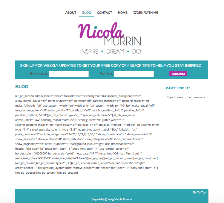
Source: Opte Website
Building my website on Divi was pretty easy. Like building any website it is fiddly as there are so many things you need to customise but it was easy to navigate and I had more control on how things were laid out. After 3 very late nights, I managed to create a lovely looking website.
But then, as I was writing this post last week, I stumbled across an article when I googled something about Divi titled 'If You Use Divi Theme With Wordpress It Better Be Forever'. Basically the article is about how when you install a different theme after using Divi, it changes everything to short code. Below is an example of what happened to my website when I reverted back to my previous theme.
I couldn't guarantee that I would want to stay with Divi forever. If I did decide that I wanted to change I would have to pay a developer thousands of dollars just to retrieve all my content. Because my website has a blog which is regularly updated that is a lot of content to retrieve.
I decided that it was better to re do my site now before I had too many blog posts written in the Divi platform.
Back to Squarespace
So back to Squarespace I went. I already knew that building websites on this platform was easy and fun if you are prepared to work with their templates, which are awesome by the way. I figured that it was easier to not be so precious about the exact placement of things and be willing to make compromises.
The funny thing is, that I found that the main customisation that I was trying to make before and was having trouble trying to CSS code it, was actually an option in the Squarespace template itself! After all that, I could actually do what I wanted anyway!
It took me the best part of 5 days to redo my website however that is only because I spent about 3 of those preparing the content for and designing my Work section. As you'll see in the main navigation above, there are 4 content heavy pages in this section so it took a while. The actual redesign of the website I already had didn't take that long.
So my website is finally done and I couldn't be more happy with the results. I'm curious though to know what you think of my new site? If you saw the one I did using Divi, do you like this one better? Let me know in the comments below
And if you are liking my new website and branding, and would like help creating your own be sure to head on over to my services page and check out my design packages. I have created them specifically with bloggers and new creative entrepreneurs in mind.
